Have you ever felt awe and delight upon first experiencing a computer interface? An interface that surprised you with its strangeness, with a sense of entering an alien world?
Some people experience this when they play imaginative video games, such as Monument Valley, Braid, or Portal. For some people, it occurs when they first understand how a spreadsheet program can be used to model a company, an industry, or even an entire country. And for some people, it occurs when they first use a programming language based on particularly powerful ideas, such as Haskell or Lisp.
My own first experience of this awe and delight was when I used the program MacPaint.
I was 11 years old. Up to that point, my experience of computers was with command line interfaces, such as the Apple II, IBM PC, and Commodore 64:
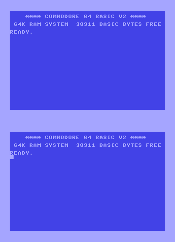
To do graphical work was complicated. On my Commodore 64, I would sometimes make games, using graph paper to sketch out the pixels in my game characters, before translating them into a sequence of numeric values for input into the computer. It was detailed, painstaking work.
One day, my parents took me to an Apple dealership. There, we saw a computer called a Macintosh, running a program called MacPaint. Using a new-to-me pointing device called a mouse, I could sketch much more directly on a virtual canvas. I remember feeling awe when I clicked on a region, and MacPaint filled the region in. It knew where the borders were! MacPaint also provided FatBits, a way to magnify the drawing, so it could be edited pixel by pixel. Most magical of all: if I made a mistake, I could undo the mistake with a click of the mouse button, returning the canvas to its previous state.
MacPaint gave me a more direct connection to my drawing, similar to using pencils or paints. But it also provided new tools making it easy to do things that were formerly difficult or impossible. Today, such tools are familiar, and perhaps seem banal. But for me they were an epiphany, transforming what it meant to draw.
Of course, most people never had the particular transformative experience I had with MacPaint. But I believe many people have been awed and delighted by some interface.
In extreme cases, to use such an interface is to enter a new world, containing objects and actions unlike any you've previously seen. At first these elements seem strange. But as they become familiar, you internalize the elements of this world. Eventually, you become fluent, discovering powerful and surprising idioms, emergent patterns hidden within the interface. You begin to think with the interface, learning patterns of thought that would formerly have seemed strange, but which become second nature. The interface begins to disappear, becoming part of your consciousness. You have been, in some measure, transformed.
What makes an interface transformational?
Most interfaces are not so striking. But the existence of such extreme examples poses a question: what qualities make an interface transformational?
To answer that question, it helps to consider another transformational technology, namely, language. Children acquire language in just a few years. It's remarkable to watch a child hear an unfamiliar word, then later speak that word aloud, and gradually come to use the word in more complex ways. Familiarity makes us take the process for granted, but it's marvellous that they can internalize an external phenomenon, and use it as a vehicle for their own thought.
Language is an example of a cognitive technology: an external artifact, designed by humans, which can be internalized, and used as a substrate for cognition. That technology is made up of many individual pieces – words and phrases, in the case of language – which become basic elements of cognition. These elements of cognition are things we can think with.
Language isn't the only cognitive technology we internalize.
Consider visual thinking. If, like me, you sometimes think visually, it's tempting to suppose your mind's eye is a raster display, capable of conceiving any image. But while tempting, this is wrong. In fact, our visual thinking is done using visual cognitive technologies we've previously internalized.
For instance, one of the world's best-known art teachers, Betty Edwards, explains that the visual thinking of most non-artist adults is limited to what she refers to as a simple “symbol system”, and that this constrains both what they see and what they can visually conceive:
[A]dult students beginning in art generally do not really see what is in front of their eyes — that is, they do not perceive in the way required for drawing. They take note of what's there, and quickly translate the perception into words and symbols mainly based on the symbol system developed throughout childhood and on what they know about the perceived object.
It requires extraordinary imagination to conceive new forms of visual meaning – i.e., new visual cognitive technologies. Many of our best-known artists and visual explorers are famous in part because they discovered such forms. When exposed to that work, other people can internalize those new cognitive technologies, and so expand the range of their own visual thinking.
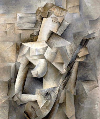
For example, cubist artists such as Picasso developed the technique of using multiple points of view in a single painting. Once you've learnt to see cubist art, it can give you a richer sense of the structure of what's being shown:
Another example is the work of Doc Edgerton, a pioneer of high-speed photography, whose photographs revealed previously unsuspected structure in the world. If you study such photographs, you begin to build new mental models of everyday phenomena, enlarging your range of visual thought:

Another class of examples comes from the many cartographers who've developed ways to visually depict geography. Consider, for example, the 1933 map of the London Underground, developed by Harry Beck. In the early 1930s, Beck noticed that the official map of the Underground was growing too complex for readers to understand. He simplified the map by abandoning exact geographic fidelity, as was commonly used on most maps up to that point. He concentrated instead on showing the topological structure of the network of stations, i.e., what connects to what:
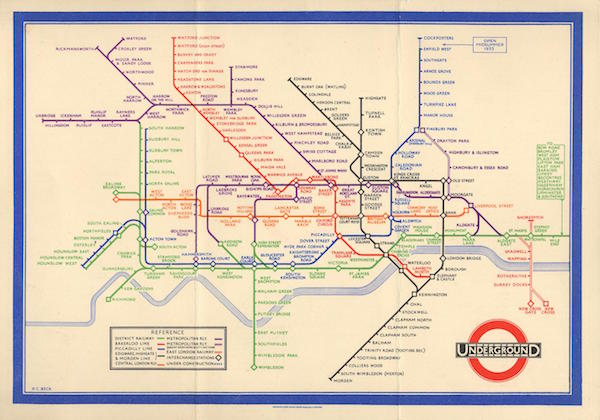
Images such as these are not natural or obvious. No-one would ever have these visual thoughts without the cognitive technologies developed by Picasso, Edgerton, Beck, and many other pioneers. Of course, only a small fraction of people really internalize these ways of visual thinking. But in principle, once the technologies have been invented, most of us can learn to think in these new ways.
Let's come back to computer interfaces.
In a similar way to language, maps etc, a computer interface can be a cognitive technology. To master an interface requires internalizing the objects and operations in the interface; they become elements of cognition. A sufficiently imaginative interface designer can invent entirely new elements of cognition:

I believe this is what made MacPaint so exciting to 11 year-old me: it expanded the range of thoughts I could think. As a practical matter, this expressed itself as an expansion in the range of visual images I could create. In general, what makes an interface transformational is when it introduces new elements of cognition that enable new modes of thought. More concretely, such an interface makes it easy to have insights or make discoveries that were formerly difficult or impossible. At the highest level, it will enable discoveries (or other forms of creativity) that go beyond all previous human achievement. Alan Kay has asked*:* Alan Kay, What is a Dynabook? (2013). “what is the carrying capacity for ideas of the computer?” Similarly, we may ask: what is the carrying capacity for discovery of the computer?
How can we invent new elements of cognition?
Of course, most interfaces are re-combinations of standard elements, and don't introduce any new elements of cognition. Are there heuristics we can use to invent new elements of cognition?
As a way of getting insight into that question, I will begin by showing a prototype interface. It's a prototype for exploring one-dimensional motion, that is, the motion of a particle on a line. To avoid disappointment, let me say that this prototype certainly isn't transformative in the same way as MacPaint! It's rough, a first sketch of an idea. But, as we'll discuss below, it illustrates two useful heuristics which can help us invent new elements of cognition.
Note that this prototype is aimed at people who've taken an introductory physics class. That means familiarity with ideas such as the potential and kinetic energy of a particle. If you've less background in physics, I hope the gist is accessible. If you've more background, please put yourself back in the mindframe of a relative beginner.
Note also that the prototype begins with some background explanation, before showing an actual interface. Here it is** An archived copy of this video is available here.:
Heuristic 1: Reify hidden representations in the interface
To understand the motivation behind this prototype, consider the following question from the mathematician William Thurston:
How big a gap is there between how you think about mathematics and what you say to others? Do you say what you're thinking?…
I'm under the impression that mathematicians often have unspoken thought processes guiding their work which may be difficult to explain, or they feel too inhibited to try…
Once I mentioned this phenomenon to Andy Gleason; he immediately responded that when he taught algebra courses, if he was discussing cyclic subgroups of a group, he had a mental image of group elements breaking into a formation organized into circular groups.
He said that 'we' never would say anything like that to the students.
His words made a vivid picture in my head, because it fit with how I thought about groups. I was reminded of my long struggle as a student, trying to attach meaning to 'group', rather than just a collection of symbols, words, definitions, theorems and proofs that I read in a textbook.
We can paraphrase Thurston as saying that mathematicians often don't think about mathematical objects using the conventional representations found in books. Rather, they rely heavily on what we might call hidden representations, such as the mental imagery Thurston describes, of groups breaking into formations of circular groups. Such hidden representations help them reason more easily than the conventional representations, and occasionally provide them with what may seem to others like magical levels of insight.
This use of hidden representations occurs in many fields. For example, electrical engineer Gerald Sussman has observed the following about understanding electric circuits:
I was teaching my first classes in electrical engineering at MIT, in circuit theory… and I observed that what we taught the students wasn't at all what the students were actually expected to learn. That is, what an expert person did when presented with a circuit… was quite different from what we tell [the students] to write down – the node equations… and then you're supposed to grind these equations together somehow and solve them, to find out what's going on. Well, you know, that's not what a really good engineer does. What a good engineer does is […]
At this point, Sussman goes into a long, informal analysis. It's fascinating, and unlike anything I've ever heard in an electric circuits class. I won't quote Sussman's analysis here – it really needs his voice and body language – but you can see it just after the 26 minute mark in his talk. Sussman concludes:
And every real engineer does that. And that was not the sort of thing which we were teaching the students.
The energy surface prototype is based on the kind of hidden representation described by Thurston and Sussman. In particular, it's based on the way I often visualize one-dimensional motion, in my work as a theoretical physicist. The visuals are not original to me: when I've shown the prototype to other physicists, several have told me “Oh, I think about one-dimensional motion like this”. But while this way of understanding may be common among physicists, they rarely talk about it. For instance, it's not the kind of thing one would use in teaching a class on one-dimensional motion. At most, you might make a few ancillary sketches along these lines for the students. Certainly, you would not put this way of thinking front and center, or expect students to answer homework or exam questions using energy surfaces. Nor would you use such a representation in a research paper.
The situation is strange. A powerful way of thinking about one-dimensional motion is largely absent from our shared conversations. The reason is that traditional media are poorly adapted to working with such representations. This prototype challenges us to build an interface which explicitly makes energy surfaces central to how we think (and communicate) about one-dimensional motion.
Such an interface would go far beyond the prototype I've shown. It would integrate energy surfaces with the traditional approach to one-dimensional motion, based on algebra, differential equations, and Newton's laws. It would thus combine both traditional and novel elements of cognition, and result in a very different way of thinking about one-dimensional motion** Since this kind of visual approach has been used by other physicists, you may object that the energy surface and other elements are not truly new elements of cognition. While that's literally true, very few people studying physics ever see this approach in any depth. And so, for most people, these are new elements of cognition..
One-dimensional motion is an important but specialized subject. What about other subjects? Are there other hidden representations used by experts, but not in general use? What were Gleason and Thurston imagining when they thought about mathematical groups? Can we tease those ideas out, and use them to inspire interface ideas? What about Sussman's way of thinking about electric circuits? Perhaps we can take some of the representations mathematicians use for thinking about high-dimensional geometry, and turn those into an interface? What about other subjects? I've used examples from physics and mathematics because that's my training, but I believe that for most subjects of any depth, experts have hidden representations that could inspire interfaces reifying those representations.
I suspect a good source of such representations is what I call minimal canonical examples. Experts often possess a stock of concrete examples that they use to reason in a way that generalizes. For instance, suppose a mathematician is working on some problem in high-dimensional geometry or topology. They may be reasoning about many spatial dimensions – maybe even an infinite number! – and yet their rough working notes are likely filled with diagrams of objects in 2 and 3 dimensions. Those diagrams help the mathematician think, standing-in for the higher-dimensional objects. For example, the mathematician Vitali Milman likes to think about high-dimensional convex bodies using diagrams showing a sort of “spiky” object, like the following:
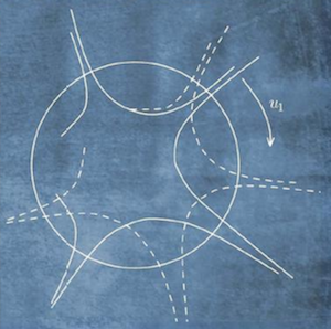
This appears strange, since convex bodies are bodies that bulge outward everywhere, like a convex lens. They certainly aren't spiky, with inward curves. But Milman uses this representation to remind himself of an extremely important and non-inuitive fact about high-dimensional convex bodies: nearly all their volume is near their surface. In 2 or 3 dimensions that fact is more accurately represented by a spiky body, like that shown above, than it is by a 2-or-3-dimensional convex body, and that's why Milman finds it a useful aid to thought.
Experts often possess many such minimal canonical examples, together with heuristics they can use to reason rapidly about the examples. Those heuristics are often quick-fire rules of thumb, full of exceptions and special clauses, not rigorous proof techniques. They let experts sketch out arguments, and figure out what is likely true, and what is likely false. In short, they're a powerful way of exploring and obtaining insight.
This contrasts with the approach in most computer reasoning systems. For instance, much work on doing mathematics by computer has focused on automating symbolic computation (e.g., Mathematica), or on finding rigorous mathematical proofs (e.g., Coq). In both cases, the focus is on correct mathematical reasoning. Yet in creative work the supply of rigorously correct proofs is merely the last (and often least interesting) stage of the process. The majority of the creative process is instead concerned with rapid exploration relying more on heuristics and rules of thumb than on rigorous proof. We may call this the logic of heuristic discovery. Developing such a logic is essential to building exploratory interfaces. I've done some preliminary investigations of what such a logic may look like in Toward an Exploratory Medium for Mathematics.
If experts often develop their own representations, why do they sometimes not share those representations? To answer that question, suppose you think hard about a subject for several years – say, cyclic subgroups of a group, to use Thurston's example. Eventually you push up against the limits of existing representations. If you're strongly motivated – perhaps by the desire to solve a research problem – you may begin inventing new representations, to provide insights difficult through conventional means. You are effectively acting as your own interface designer. But the new representations you develop may be held entirely in your mind, and so are not constrained by traditional static media forms. Or even if based on static media, they may break social norms about what is an “acceptable” argument. Whatever the reason, they may be difficult to communicate using traditional media. And so they remain private, or are only discussed informally with expert colleagues.
Heuristic 2: Reify deep principles about the world in the interface
In the traditional approach to one-dimensional motion, the principle of conservation of energy is written in an algebraic form, as:
½ m v2 + U(x) = constant
In an expert's hands this is a powerful basis for thinking about the system. However, it has many limitations. The connections to motion are left implicit, not explicit: we don't directly see space or velocity or the particle's trajectory; we don't directly see the potential or the energy. By contrast, the energy surface interface makes these things explicit and easy to manipulate; it directly reifies the principle of conservation of energy. This makes it effortless to pose and answer questions that require much work in the algebraic approach.
This shouldn't be confused for an argument that visualization is good, and algebra is bad. There is a cargo cult mentality which embraces visualization for the sake of visualization. In fact, there is no a priori reason a visual approach is superior. Rather, one must understand both the benefits and deficits of any specific approach.
A good demonstration of this is the remarkable book Structure and Interpretation of Classical Mechanics, by Sussman and Wisdom. The book explains the ideas of classical mechanics through the medium of Lisp programs. In our terms, the book implements a Lisp-based interface to classical mechanics, complete with many new elements of cognition. It thus provides new ways of thinking about classical mechanics, but is not a visual interface.
Returning to conservation of energy and the energy surface prototype, there's a useful heuristic here: any deep principle is an opportunity to create powerful interface ideas. Every theorem of mathematics, every significant result of science, is a challenge to our imagination as interface designers. Can we find ways of expressing these principles in an interface? What new objects and new operations does a principle suggest? What a priori surprising relationship between those objects and operations are revealed by the principle? Can we find interfaces which vividly reveal those relationships, preferably in a way that is unique to the phenomenon being studied? By answering these questions, we can turn a surprising and non-intuitive principle into a source of intuition and novel understanding.
One consequence of reifying deep principles in an interface is that mastering the subject begins to coincide with mastering the interface** I discuss this also in Toward an Exploratory Medium for Mathematics (2016).. This is visible already in the energy surface prototype, where mastering the interface requires understanding the relationship between the potential, the energy surface, and the trajectories. Thus, mastering the interface requires understanding a lot of physics!
Another example of this phenomenon is the program Photoshop, which builds in many deep principles of image manipulation. As you master interface elements such as layers, the clone stamp, and brushes, you're well along the way to becoming an expert in image manipulation. Similarly, someone who masters the interfaces in Structure and Interpretation of Classical Mechanics necessarily learns a lot of classical mechanics. By contrast, the interface to Microsoft Word contains few deep principles about writing, and as a result it is possible to master Word's interface without becoming a passable writer. This isn't so much a criticism of Word, as it is a reflection of the fact that we have relatively few really strong and precise ideas about how to write well.
An interface for projectile motion
Let me show another prototype interface illustrating the two heuristics I've identified. This second prototype is intended to help us explore two-dimensional projectile motion. Although that may sound similar to the energy surface prototype – it's just classical mechanics in one more spatial dimension! – it's actually a very different subject, and the interface is, accordingly, very different. It's also more ambitious than the prototype for one-dimensional motion, in that I'll use it to attack a problem I didn't know how to solve before building the interface. As before, it's a rough sketch, and presumes comfort with basic mechanics and mathematics. Let's take a look** An archived copy of this video is available here.:
This prototype uses both our heuristics. The fan of multiple trajectories and the wavefront of projectile positions are representations familiar to some experts, but are unknown to most students of physics. And those representations, in turn, reify a fundamental theorem of mechanics, expressing the range of trajectories that can pass through two specified points.
The projectile prototype is very different from the energy surface prototype. This is perhaps surprising, because in the traditional algebraic approach, one- and two-dimensional motion appear similar. But that similarity is superficial and misleading. In fact, very different ideas help to understand motion in the two cases. For instance, the trajectory fan helps in two dimensions, but is less useful in one dimension, where the particle merely moves back and forward on the line. As another example, in one dimension the trajectories are completely determined by the principle of conservation of energy. In two dimensions, that's no longer true, and so the principle is less useful. Differences such as these are obscured in the traditional algebraic approach, and experts take years to internalize them. But in interfaces reifying the deepest ideas about a system, such differences are immediately evident.
Conclusion
In the 1960s and 1970s, Douglas Engelbart, J. C. R. Licklider, Alan Kay, and others developed a vision of computers as devices for augmenting and extending human beings. This vision strongly influenced later researchers and entrepreneurs, including people such as Steve Jobs, and has now entered mainstream media accounts.
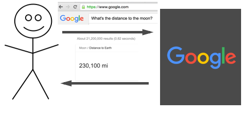
A common informal model of augmentation is what we may call the cognitive outsourcing model: we specify a problem, send it to our device, which solves the problem, perhaps in a way we-the-user don't understand, and sends back a solution:
So, for example, if I want to know the distance to the moon, I send the question to Google, which sends back an answer:
Or I can ask Google Maps the route from my office to Berkeley:

Many people implicitly or explicitly use this cognitive outsourcing model to think about augmentation. It's commonly used in press accounts, for instance. It is also, I believe, a common way for programmers to think about augmentation.
In this essay, we've seen a different way of thinking about augmentation. Rather than just solving problems expressed in terms we already understand, the goal is to change the thoughts we can think:

One challenge in such work is that the outcomes are so difficult to imagine. What new elements of cognition can we invent? How will they affect the way human beings think? We cannot know until they've been invented.
As an analogy, compare today's attempts to go to Mars with the exploration of the oceans during the great age of discovery. These appear similar, but while going to Mars is a specific, concrete goal, the seafarers of the 15th through 18th centuries didn't know what they would find. They set out in flimsy boats, with vague plans, hoping to find something worth the risks. In that sense, it was even more difficult than today's attempts on Mars** This analogy was suggested to me by Toph Tucker..
Something similar is going on with intelligence augmentation. There are many worthwhile goals in technology, with very specific ends in mind. Things like artificial intelligence and life extension are solid, concrete goals. By contrast, new elements of cognition are harder to imagine, and seem vague by comparison. By definition, they're ways of thinking which haven't yet been invented. There's no omniscient problem-solving box or life-extension pill to imagine. We cannot say a priori what new elements of cognition will look like, or what they will bring. But what we can do is ask good questions, and explore boldly.
Acknowledgements
Thanks to David Albert, Hannah Davis, Chaim Gingold, May-Li Khoe, Hassan Masum, Andy Matuschak, Robert Ochshorn, Caitlin Sikora, Toph Tucker, and Devon Zuegel for discussion of the ideas that led to this essay. This work was begun at the Recurse Center, and completed at YC Research.
Citation
In academic work, please cite this essay as: Michael Nielsen, “Thought as a Technology”, available at http://cognitivemedium.com/tat/index.html (2016).
Background
Broad origin: This essay arose out of my attempts to make sense of the work of some of the great interface designers, including Douglas Engelbart, Alan Kay, Bret Victor, and others. See, for an entrée, Engelbart's Augmenting Human Intellect, Kay and Goldberg's Personal Dynamic Media, and Victor's Media for Thinking the Unthinkable.
On internalizing signs found in the external world: See the work of Lev Vygotsky, especially “Internalization of Higher Psychological Functions”, Chapter 4 in an edited and translated collection of some of Vygotsky's writing, “Mind in Society”, Harvard University Press (1978).
On using using computers to create new (micro-)worlds: See the work of Seymour Papert, especially his book “Mindstorms”, Basic Books (1980).
On reifying hidden representations: This was inspired in part by the work of Steven Wittens, especially his extraordinary rendition of the Fourier transform. Of course, the heuristic is used in much other work, but Wittens' work shows it in a particularly sharp and effective form.
On reifying deep principles: This was inspired in part by Kasper Peulen's Euclid: the Game, which builds up an interface using ideas from Euclidean geometry. Again, this heuristic is used widely, but Peulen's game shows it in a particularly well distilled form.
